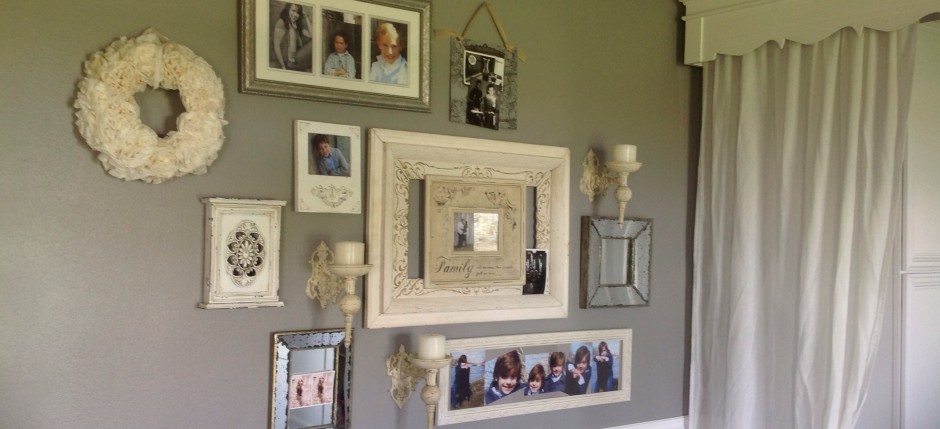
How to create a wall gallery
Creating a wall gallery can be so overwhelming for some people.
Here are a few simple ways to get started & a real life example of how one came together.
- Gather all of your frames, artwork & other pieces you plan on using FIRST! I don’t recommend “adding” to it once you have started the gallery on your wall. If you don’t want to fill all of your frames just yet, I completely understand not filling them. But at least have the frame ready & hanging in your gallery.
- Don’t have all the same frames. It tends to be a little boring. Live a little.
- Area….I always think that a wall gallery should be placed where there is going to be lots of traffic for EVERYONE to enjoy. An entryway, stairway, above a couch, hallway…there are so many places.
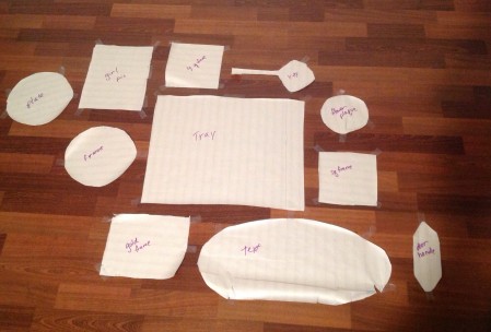
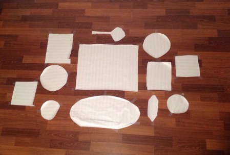
- Once you have the pieces you are using & the area you want to put your wall gallery in, trace each of your items onto brown or white paper & cut them out.
- Starting with larger items first (usually in the middle with large items) start playing around with the placement using your cutouts. You could use the cutouts on the actual wall if you want or just on the floor. I recommend taping them to the wall. Then you get an actual visual in the exact space you are using.
- Keep in mind the flow of traffic or where you want people’s eye to lead.
- Spacing doesn’t have to be exact. It’s hard to space a round frame with a rectangular frame. Don’t get hung up on this. You don’t want a huge gap in between your items so try to keep it evenly spaced by using your eye. I usually try to get the majority of them about 2 inches apart but it varies with the different items.
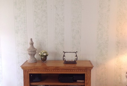
My aunt has an area in her family room entrance where she has a bookshelf to store the house phone, some books, & a few other misc. items she needs at her fingertips. Wanting to update & freshen up the area, we thought a wall gallery would look nice.
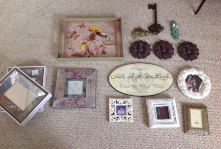
So she went on a hunt…in her own house. You don’t have to stick to just frames. In fact, it looks better if you incorporate some piece of art or different items. She found some great stuff. The only thing she bought was the plate. It goes perfectly with the color scheme.
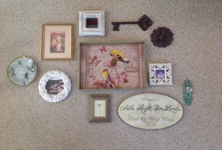
Since I’m so far away and can’t be there with her to give her my ideas with the actual items, I thought I would give her a few options via email. I cut out all of the shapes to size out of paper that she wants in her gallery.
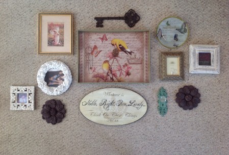
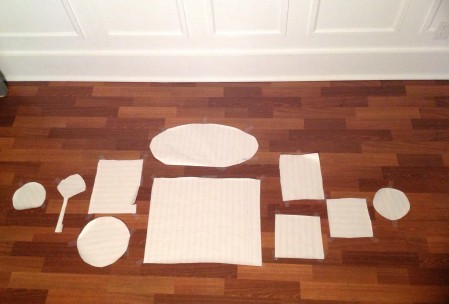
Then the fun began, placing them in a few different galleries. Here are the three I came up with.
I like this option because it flows with you while walking into her family room & keeps the flow of your eye moving into the family room.
I thought option#2 was nice because it sort of separates the space between the entry & the actual family room. It stops the eye from continuing to flow into the family room, which is sometimes what you want….for people to enjoy your pictures.
Option #3 is neat because it seems to keep your eye flowing right to the family room but also while seated in the family room, your eye can continue to flow right back out into the kitchen area. It keeps the two rooms connected.
HELP HER CHOOSE
I would LOVE to hear which one you would choose. Please leave a comment to help her decide.
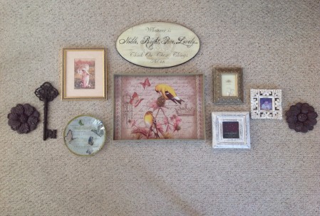
My vote is on option #2!
I like option 3 and if she doesn’t go with it – I will rearrange the collage next time I visit (teasing! haha!) You’re a sweetie for helping her!
Thanks Elizabeth for your vote! Haha…you are too funny!
I like option #1
Option #2!